I Had One Slide to Present a Year's Worth of Work to the CEO

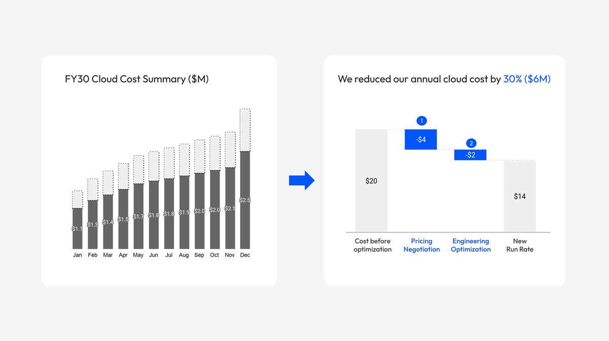
Note: I'm starting a new series called Slide Makeover, where I apply the principles from The Art of Exec-Ready Presentations to slides I created earlier in my career. In each post, I walk through what I was trying to achieve, what I would do differently today, and why.
It was my third meeting with the CEO since joining the company. I had spent the better part of a year on reducing cloud cost, negotiating better pricing with our cloud providers and partnering with engineering on a series of optimization initiatives. This meeting was to update the CEO on the progress we'd made. It was important for me to nail this because this update was essentially a report card on myself. I wanted to highlight the savings we'd achieved.
This is the slide I used (figures and dates modified).
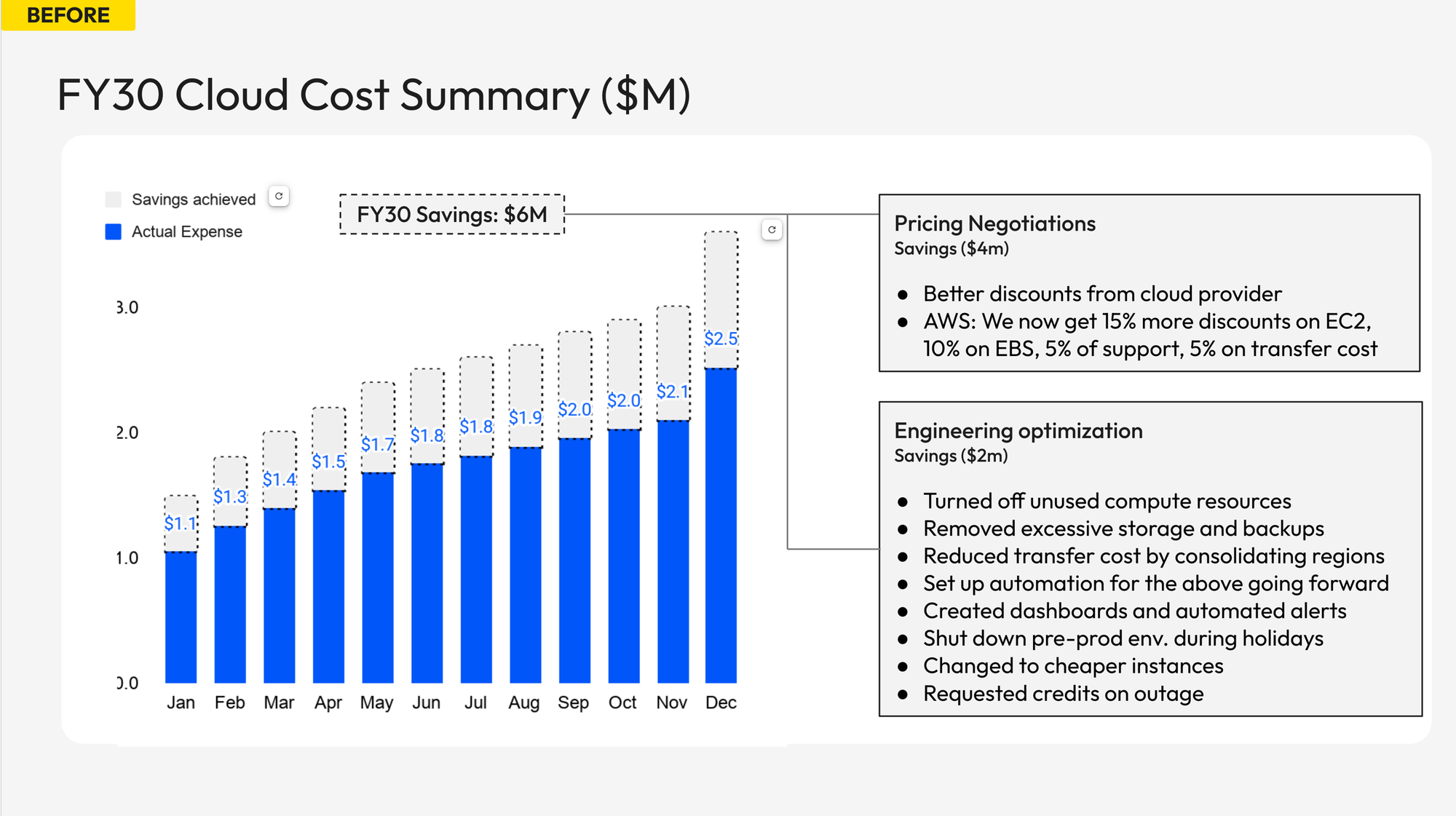
Looking back, this slide isn't too bad. I presented the cost we would have incurred had we done nothing and the actual savings we'd built consistently across the year through the optimization efforts.
That said, looking at it today, I see a few areas that can be improved:
- The headline does not have a point of view. "Cloud Cost Summary" tells the CEO what the slide covers, but not what to conclude.
- The monthly view is the wrong altitude. What the CEO needs is the annual picture. Without that context, it is hard to know how meaningful the $6 million actually is.
- The contribution of the two workstreams is invisible. Pricing negotiation and engineering optimization are distinct factors, but the chart lumps them together as one savings bucket.
How I Would Build It Today
Now let me walk you through how I would approach this differently step by step, starting from a blank sheet of paper.
The first thing I think about is the headline.
The mental framework I use: if I did not have a slide deck and just had a two-minute conversation with the CEO, what would I say?
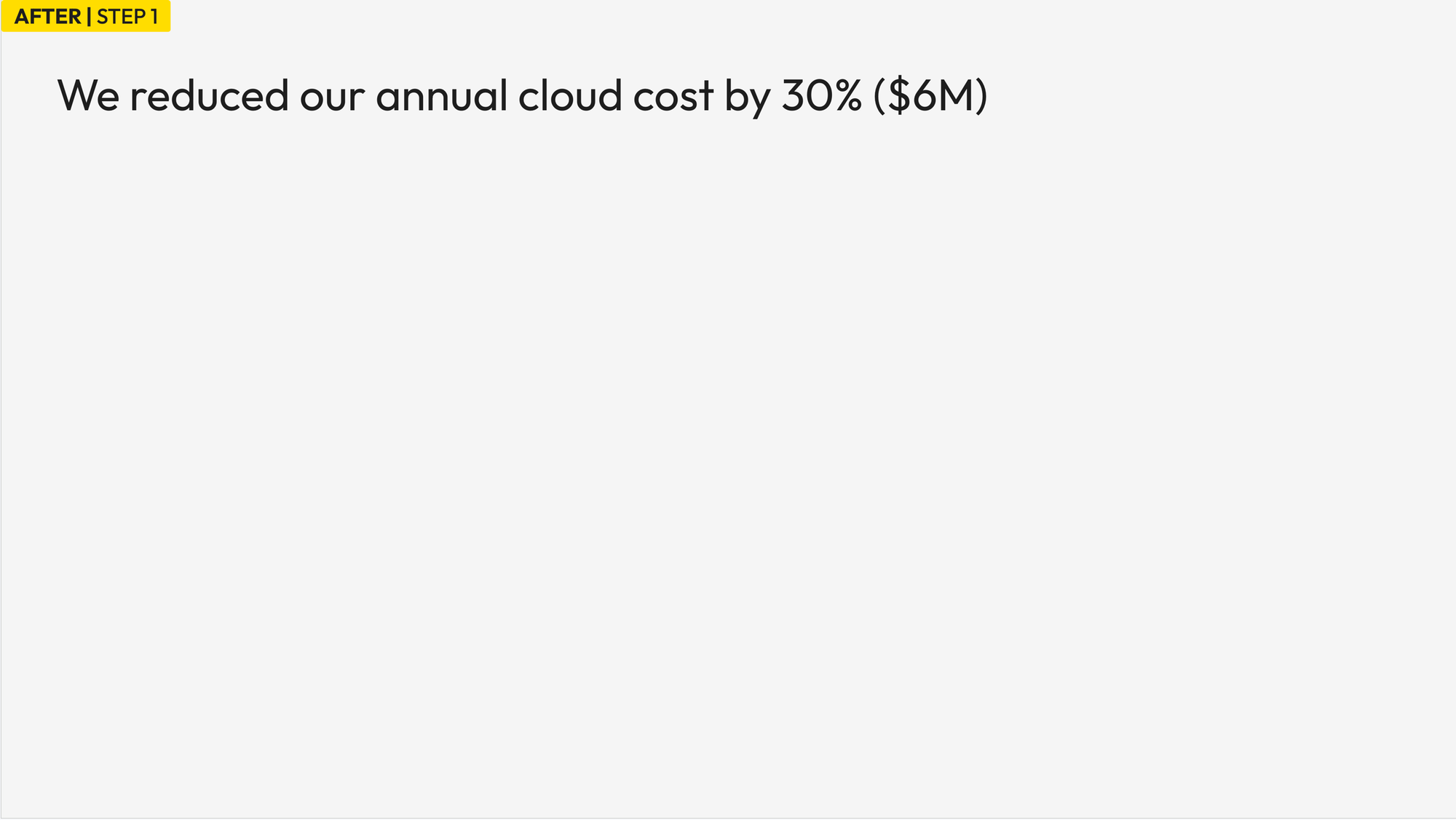
This forces me to distill the message before writing the slide. The key takeaway is that we've reduced our annual cloud cost by 30%, which is $6 million in savings. It's important to emphasize both numbers to put the results in context: The $6 million is money that would have gone out the door. The 30% tells you how significant that is relative to total spend.
My first draft was "We successfully reduced our annual cloud cost by 30% ($6M) through pricing negotiation and engineering optimization" but it didn't fit in one line, so I just kept the first part.
That becomes the headline. Everything else goes to support it.
The second thing I think about is the right visual.
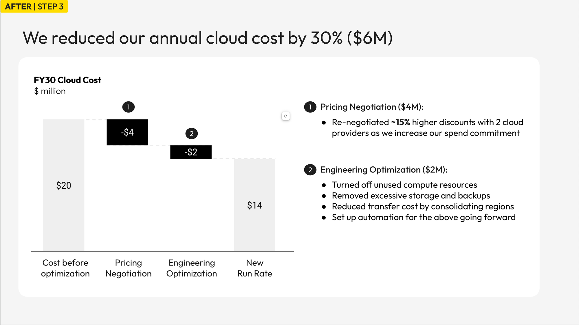
The original chart shows monthly spend in twelve bars. That made sense for how I managed the business day to day, but it is too detailed for a CEO conversation. Again, an annual view makes more sense. The story I want to tell is simple: we would have spent $20M for the full year, but because of our efforts we saved $6M and actually spent $14M. Now let me walk you through what we did.
Once I establish that framing, a waterfall chart (or a "bridge" in finance and consulting speak) is much more effecitve: It walks from a starting point to an ending point, with each contributing factor shown as a bridging step in between.
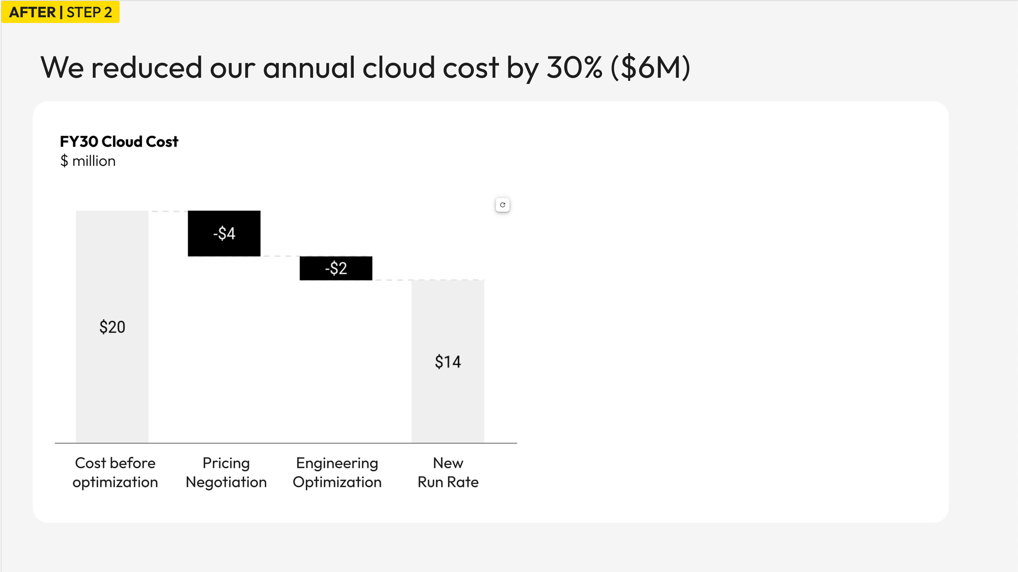
Three things are now immediate that were invisible before: where we started, where we ended up, and what drove the change. The 2:1 ratio between pricing negotiation and engineering optimization also becomes clear.
The third thing I think about is how much context to add.
The waterfall shows the numbers, but the CEO needs enough context to make sense of each component. What works well here is signposts. I added two numbered circles above the bars with a brief annotation on the right. Pricing negotiation is about re-negotiating discounts with two cloud providers. Engineering optimization covers the initiatives we drove with engineering to eliminate waste and automate resource conservation.
The final step is directing attention.
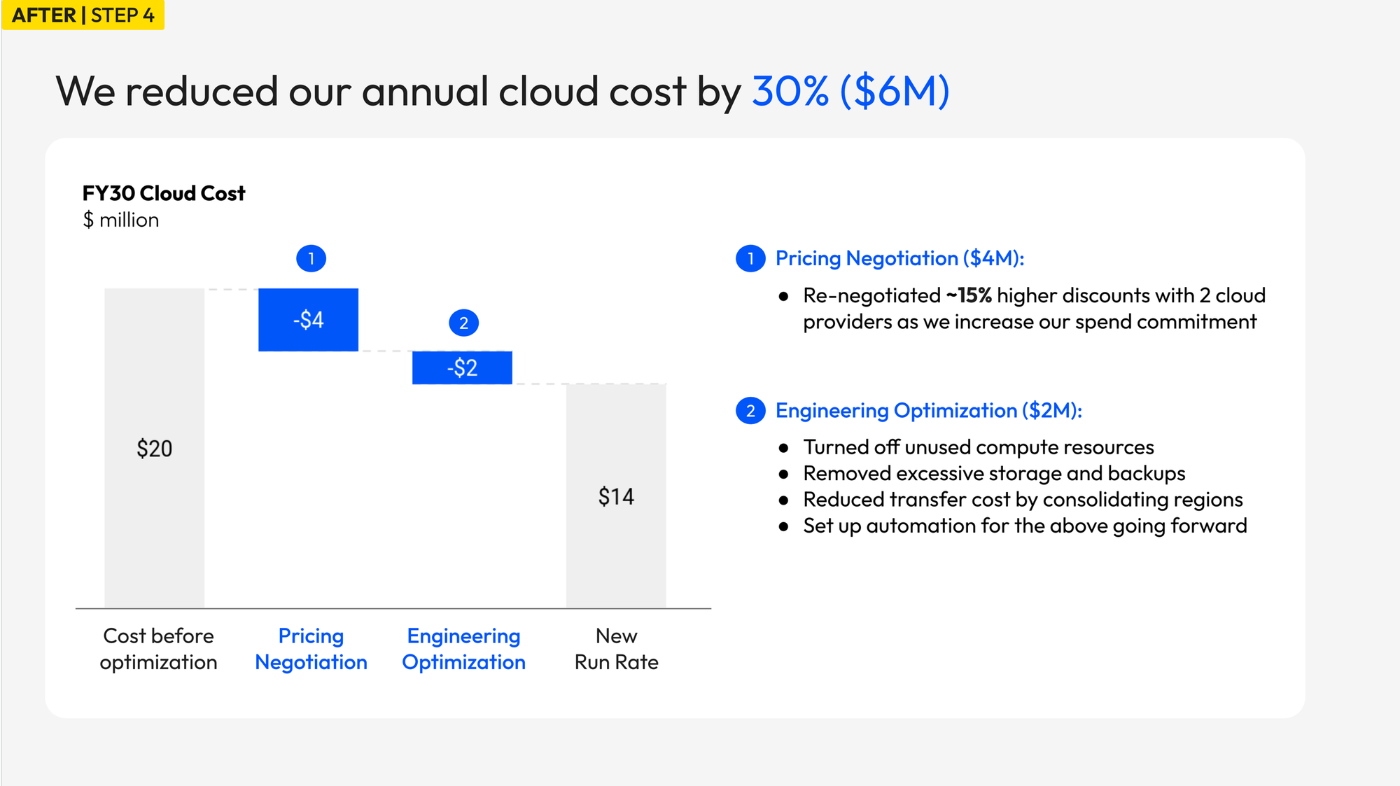
Once the slide is largely complete, I think about highlighting roughly 10% of the page so it is immediately clear where to look.
I colored the two savings bars in blue, along with the signpost numbers and annotation headers. The before and after bars stay neutral gray.
Now anyone looking at this for the first time sees what matters first: pricing negotiation saved $4 million, engineering optimization saved $2 million, which adds up to the total in the headline.
Final Thoughts
When I prepped for this CEO update, I created many detailed slides. It was tempting to add more: more data, more context, more bullets. But my consulting days taught me that it's more important to have one valuable "money slide" than many mediocre ones. A "money slide" has to be simple and compressed. It requires deciding what the one thing is and making every other element on the page serve that one thing.
Every change in this makeover had the same goal: make it easier for the CEO to understand the result with minimal friction. The headline leads with the conclusion. The waterfall answers the so what. The color tells him where to look.
If you have an executive update coming up, the following questions will help you get clarity:
- If you had no deck and just two minutes with this person, what would you say? Write that sentence down. That's your headline.
- What's the simplest possible visual to get your point across?
- What's the right level of detail on the page?
- If you can highlight only 10% of the page, what would you do?
If you want to go deeper on presenting to executives, grab my book The Art of Exec-Ready Presentations for free.
I write a weekly newsletter on executive communication with senior leadership. Subscribe below to get the updates.